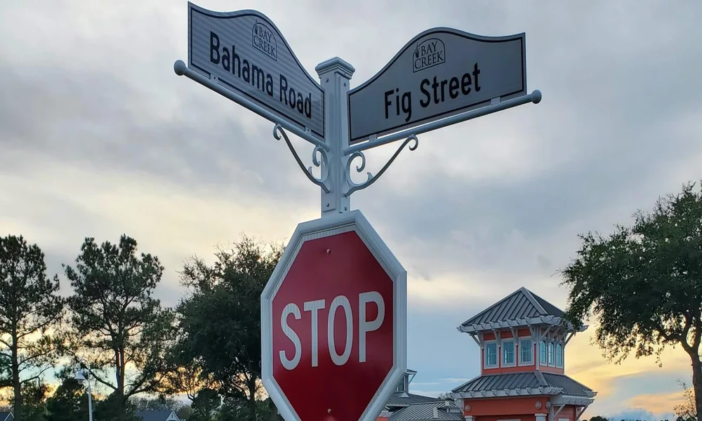
Nothing undermines a beautiful streetscape faster than clunky, uninspired signage. Yet, the reverse is just as true: a thoughtfully designed street sign or address plaque can elevate an entire block, guiding visitors while leaving a memorable impression.
Balancing Style and Functionality in Street Signage
Street signs have always been workhorses of urban life, providing vital wayfinding information with a single glance. But their role doesn’t end there. The best signage acts as a bridge between form and function, pushing past mere utility to add character to the built environment.
The Dual Role of Street Signs: Navigation vs. Aesthetic Appeal
On one hand, street signs need to be immediately legible, withstand the elements, and hold up to daily scrutiny. On the other, they are also among the first details people encounter when approaching a home, business, or neighborhood. As a result, signage plays a key part in shaping first impressions. The intersection between these needs, clarity and beauty, is where great street sign design thrives.
Why Stylistic Elements Matter Beyond Basic Visibility
Incorporating stylistic elements into signage does more than boost curb appeal. It signals care, attention to detail, and a sense of belonging. A unique address plaque, well-chosen font, or custom material can help a property stand out or blend harmoniously with local architecture.
Traditional vs. Modern Design Approaches
Design traditions run deep when it comes to signage, but modern options are more diverse than ever.
Classic Engraved Plaques: Timeless Elegance and Durability
Engraved plaques, often crafted in metal or stone, offer a sense of permanence and sophistication. Their deep etching resists weather and time, making them a staple for historic homes and buildings aiming for a dignified look.
Minimalist Individual Numbers: Clean, Contemporary Impact
For those who prefer a modern aesthetic, minimalist numerals mounted directly to a façade deliver crisp clarity. The absence of a backing plaque lets architectural materials shine, and the effect can be both subtle and striking.
Numbers on Bars: Practicality Meets Visual Attraction
Mounting address numbers on a horizontal bar is both practical and eye-catching. This approach ensures even spacing, simplifies installation, and draws the eye in a deliberate way, an ideal solution for contemporary homes and commercial buildings alike.
Material Choices and Their Influence on Style and Longevity
Material choice is one of the most consequential decisions in signage design. It directly affects both appearance and resilience.
Metals: Bronze, Brass, Aluminum, and Stainless Steel
Metals are prized for durability and a touch of luxury. Bronze and brass lend warmth and heritage, while aluminum and stainless steel deliver a sleek, modern feel. The finish, brushed, polished, or weathered, can further fine-tune the sign’s character.
Non-Metal Options: Slate, Acrylic, and Vinyl Lettering
Slate offers natural texture and a subdued palette that pairs well with older architecture. Acrylic brings color and crisp edges, suiting contemporary projects. Vinyl lettering is versatile, especially for temporary or budget-conscious needs, though it may lack the longevity of other materials.
How Environment Shapes Material and Finish Selection
Montreal winters, with their intense cold and snow, put signage to the test. Choosing weather-resistant materials and appropriate finishes is essential to prevent fading, corrosion, or structural damage. Design studios like Orthografica Montreal make a point of recommending the best material for each setting, ensuring years of clarity and curb appeal.
Customization Options for Different Property Types
Signage isn’t one-size-fits-all. The best approach varies by property type.
Residential Solutions: Single-Family Homes vs. Multi-Unit Entries
For homes, the focus is often on uniqueness and integration with the façade. Multi-unit buildings require clear demarcation for visitors and deliveries, often using coordinated plaques and directories to maintain a cohesive look.
Commercial and Public Spaces: Branding through Signage
Businesses have the additional task of communicating brand identity. Custom nameplates, wayfinding systems, and illuminated signs all serve to reinforce a professional image while guiding clients and staff.
Coordinated Wayfinding and Directory Signage
Consistent visual language across directories, arrows, and markers makes navigation intuitive and contributes to an orderly aesthetic, especially in larger residential complexes or office buildings.
Installation Considerations and Impact on Style
A sign’s impact is only as strong as its placement and installation quality.
Mounting Techniques for Various Surfaces: Brick, Stone, Wood
Proper mounting techniques ensure stability and crisp presentation, whether on brick, stone, or wood. Templates and specialized anchors prevent misalignment, while preserving the structural and visual integrity of the wall.
Size and Placement Strategies for Maximum Readability
Sightlines, distance from the curb, and lighting conditions all inform the ideal size and placement. The goal is visibility without overwhelming the façade.
Illuminated vs. Non-Illuminated Signs: Night Visibility vs. Design Integrity
While illuminated numbers offer valuable nighttime visibility, especially for visitors and emergency services, some homeowners opt for non-illuminated signs for a subtler appearance. The right choice balances visibility needs with the desired ambiance.
Comparative Cost and Maintenance Factors
The decision between custom and standard signage is often about balancing upfront cost with long-term value.
| Option | Upfront Cost | Weather Resistance | Maintenance Needs | Lifespan |
|—————————–|————–|——————-|————————-|——————|
| Standard (Pre-Fab) | Low | Moderate | Replace as needed | 3-10 years |
| Custom Engraved Plaques | High | Excellent | Occasional cleaning | 20+ years |
| Minimalist Metal Numbers | Moderate | Excellent | Minimal | 15-20 years |
| Acrylic/Vinyl Lettering | Low | Fair | May peel/fade | 3-7 years |
Montreal’s harsh winters demand durable solutions, making the initial investment in quality materials worthwhile over time.
Integrating Brand Identity and Neighborhood Character
No two neighborhoods are alike, and the most effective signage reflects that diversity.
Working Within Brand Guidelines vs. Creating Unique Styles
For businesses, cohesive signage that respects existing brand guides is a must. For homes or boutique properties, designers may draw on local architecture or personal taste to forge a distinctive look.
Reflecting Local Architecture and Community Vibes
Materials, colors, and forms can echo the surrounding landscape or neighborhood character. In Montreal, a city known for its eclectic mix of old and new, this can mean anything from ornate bronze for a stone mansion to playful acrylic for a mid-century triplex.
Case Studies: Successful Projects in Montreal
Across its neighborhoods, projects like those by Orthografica Montreal highlight how tailored signage brings both order and artistry to the urban landscape, serving practical needs while standing as quiet testaments to thoughtful design.
Choosing the Right Approach: Decision-Making Framework
The path to the perfect street sign isn’t always obvious. Assessing site needs, environmental challenges, and budget helps narrow choices.
– Consider the property’s style and the local climate.
– Balance initial investment with long-term maintenance.
– Collaborate with experienced designers and fabricators for results that function brilliantly and look even better.
When style and function go hand in hand, street signage becomes more than a marker, it’s a statement.